
Show Business is a one-of-a-kind series that teaches marketers the skills they need to create a compelling video series or podcast for their business. When folks enter their email address, they immediately gain access to 3+ hours of video content, free downloads, behind-the-scenes content, and more.
The series is organized into four different content categories that span everything from coming up with an idea for a show and preparing for production to recording the content itself and launching the final product. Viewers can also take a quiz after watching all content and get certified in Brand Show Creation.
Show Business brings category experts together to provide marketers and creatives with all the resources and inspiration they need to create their very own video series or podcast.
Aesthetically, Show Business utilizes our brand typeface's multiple weights and whimsical collages to visualize complex ideas in an energetic way. These elements paired with original interviews, colorful b-roll shot in our studio, and stock footage create an exciting, fast-paced show. These different pieces gave us the flexibility and speed to pull together the series on an aggressive timeline.

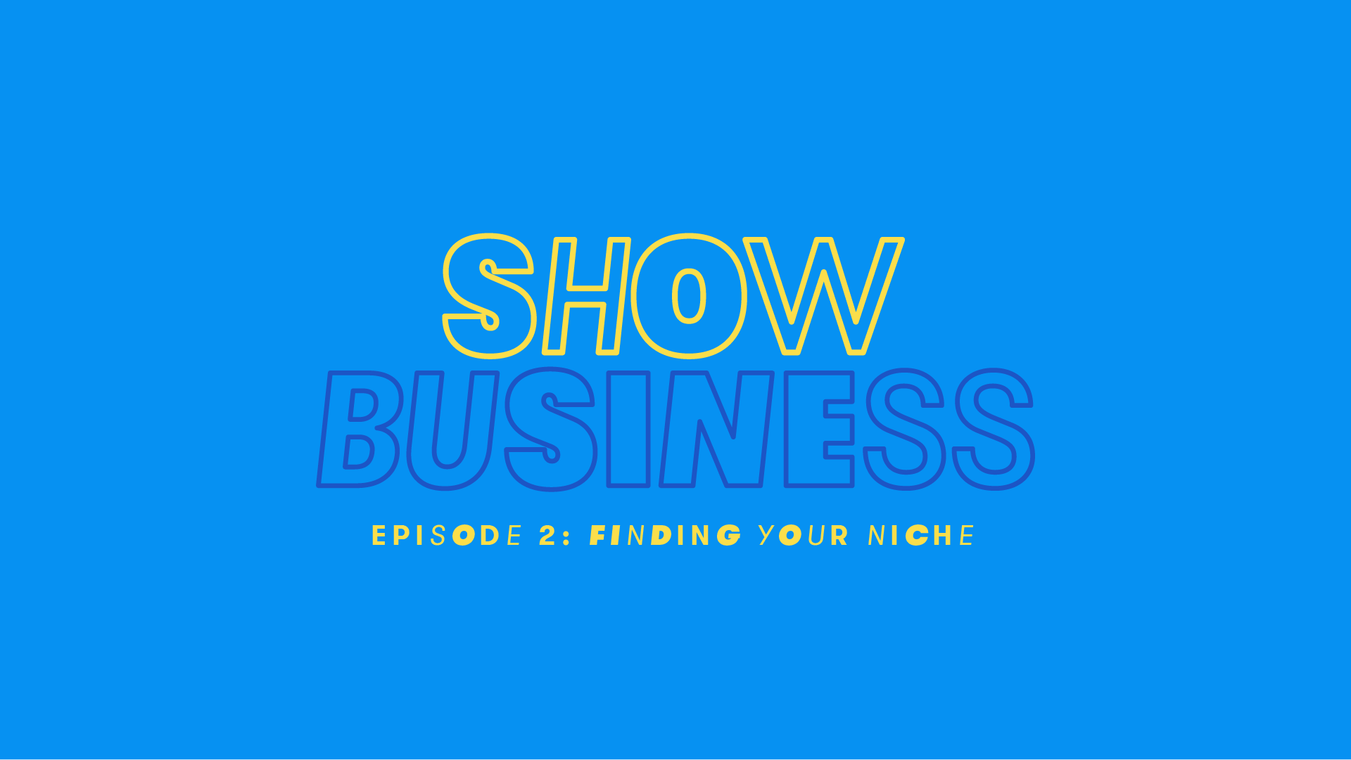
Logo assets are available in a variety of color combinations and sizes.

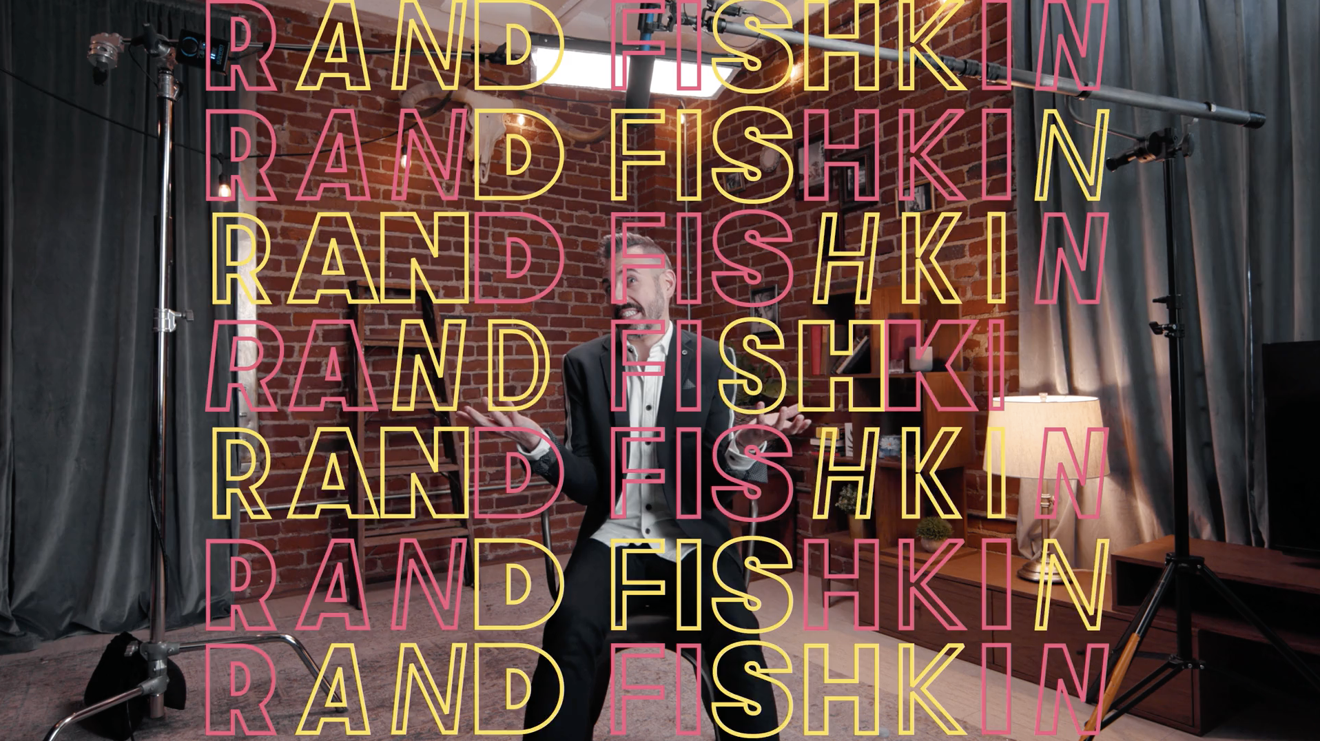
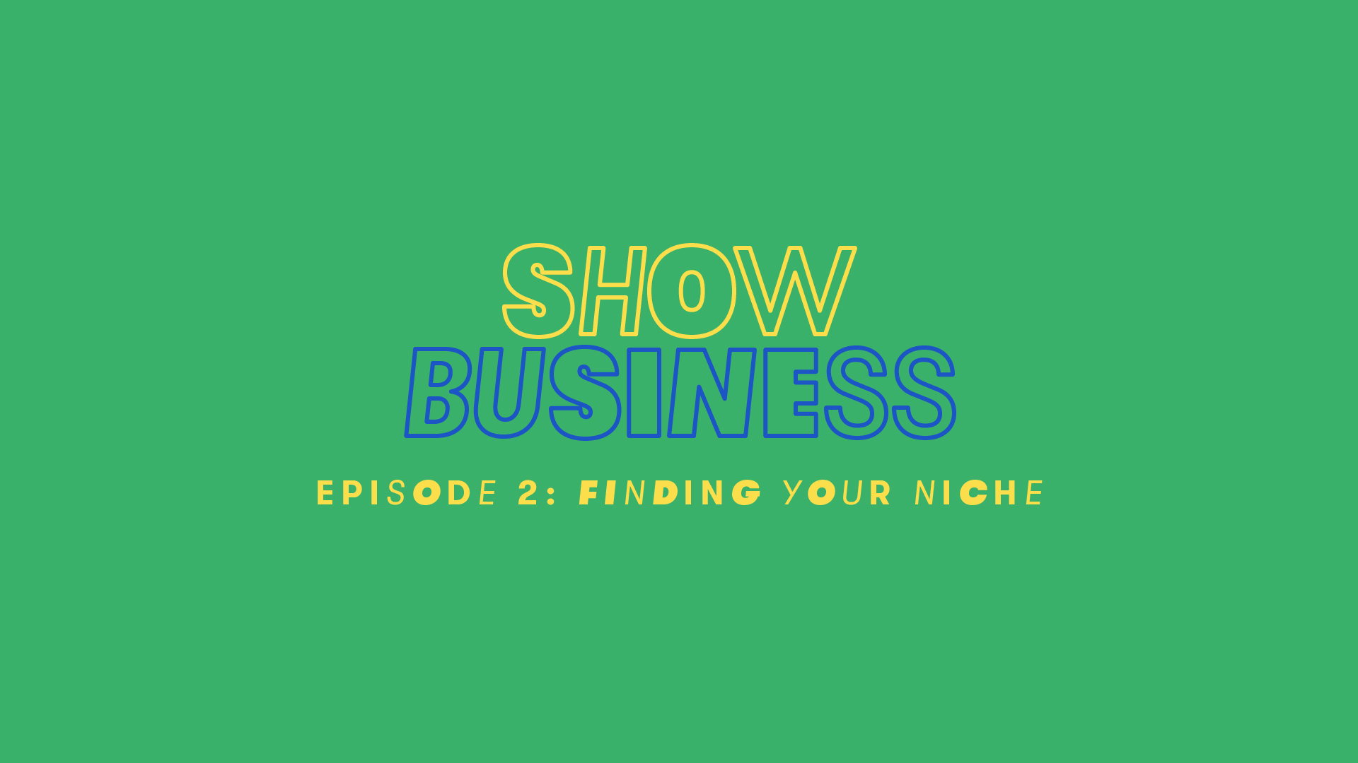
Show Business uses the many weights of Wistia's brand typeface, GT Walsheim all together and all at once. Individual letters are set differently from their neighbors, creating a kinetic patchwork effect.
Letters may also be treated with two distinct visual styles. They can be outlined, which, combined with the flickering motion of the changing typeface, evokes memories of the old neon signs that advertised shows along Broadway and Vegas. Or, they can be treated with a fill color.
The occassional use of a slab-serif, Hatch, allows us to add additional depth to type compositions. Hatch should be used sparingly, and only one letter at a time.
Type is always set in all-caps within individual episodes, and as headlines in other applications. GT Walsheim Regular or Medium can be used in title-case for supporting copy on sites and banner ads.
Show Business uses the same basic palette created for Wistia's Brand Affinity Marketing Playbook. The colors are brighter and more saturated than Wistia's core color palette.
#0691F2
#1C55C5
#3AB16A
#EE5178
#B98BE8
#FBDE4B

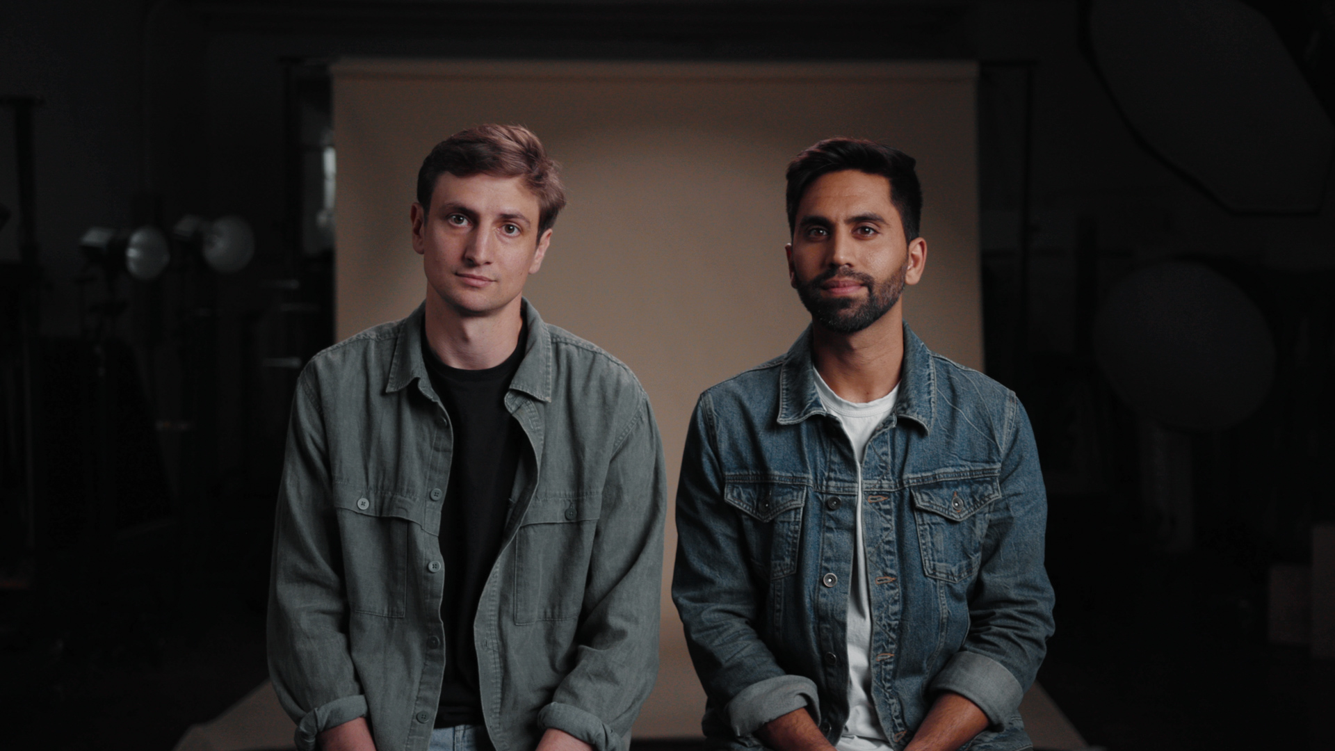
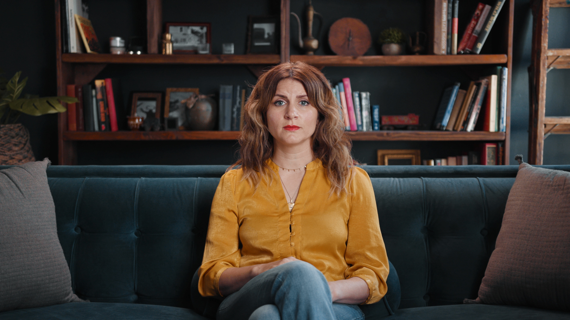
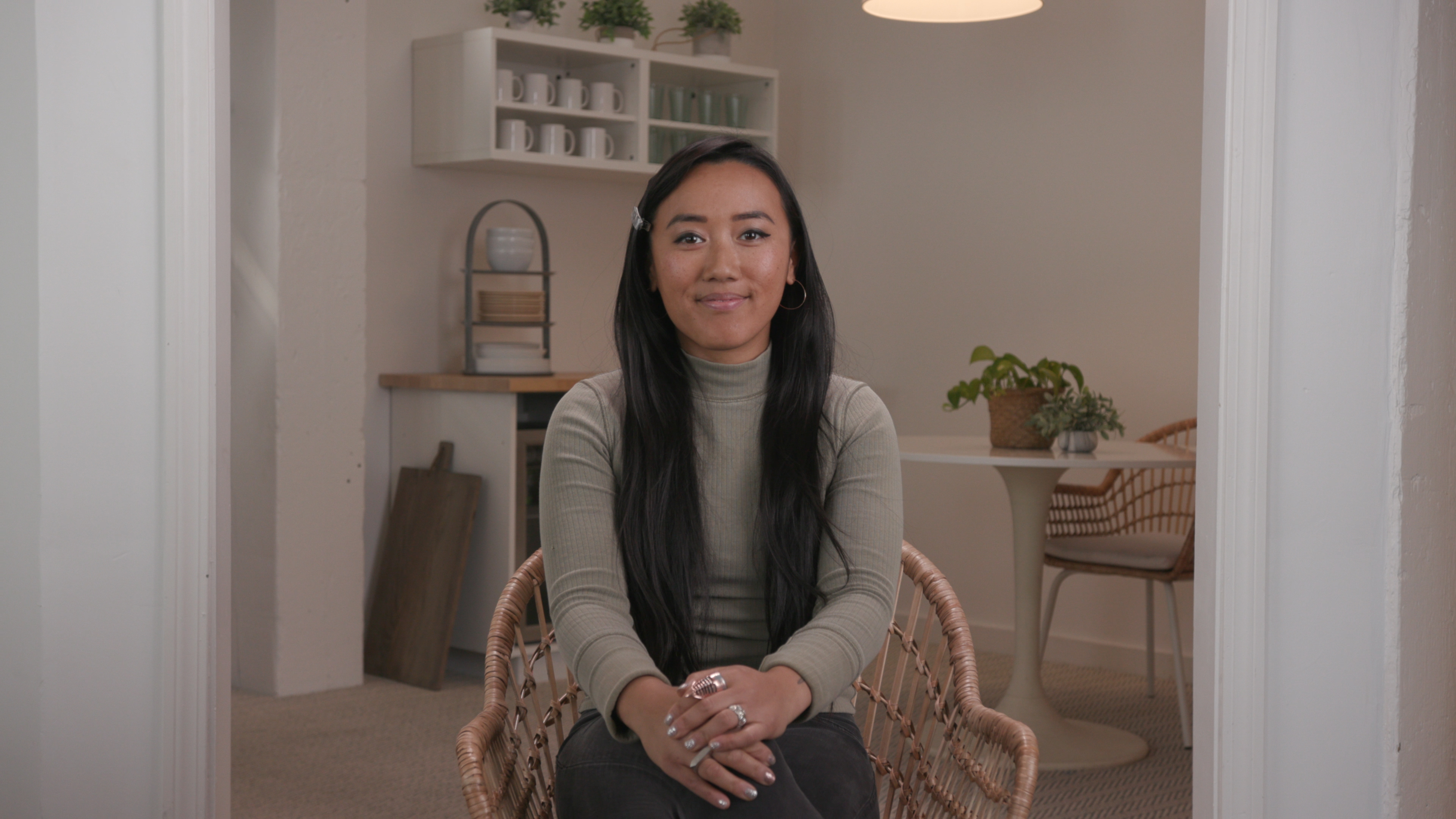
Interviews should be filmed with the most symmetry that can be achieved on location. Participants are centered, ideally utilizing a one-point perspective to draw the viewer's eye towards the center of the screen. This allows the viewer to keep their eyes focused during the quick cuts that Show Business will be utilizing in the edit.

Collage illustrations are a fantastic way to bring life and energy to more obtuse or complicated ideas. They should lean into their whimsy, in subject matter, and in how they’re animated.

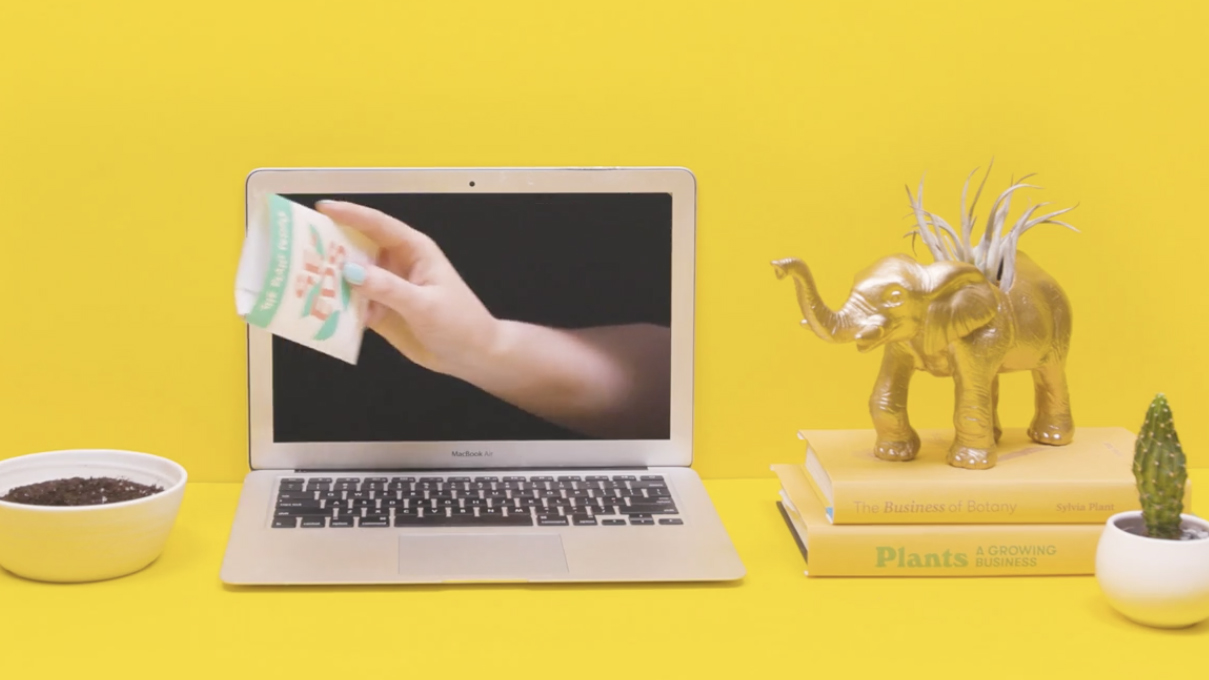
Footage shot on seamless backdrops should use simple metaphors to help communicate the ideas being presented. Like the interviews, the focal point of the shot should be centered to allow for quick cuts.
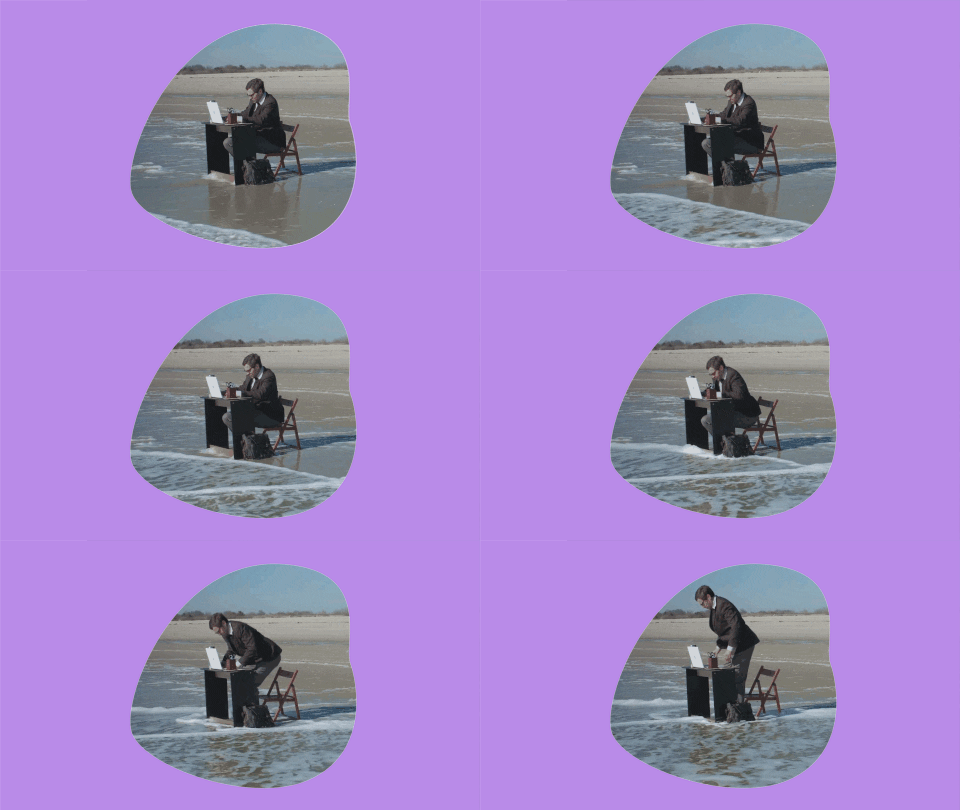

Stock footage should be masked within a color field to help visually relate the archival footage to the other visual elements.